Your Topography Pattern Is Fake, and Here's How to Tell

Contour lines are having a decade. They're on running shoes, coffee bags, gym walls, trail-brand hoodies, conference badges, and roughly one in four tech company backgrounds. The look is clean, technical, and outdoorsy at once — easy to see why it caught.
Almost none of it is real.
The overwhelming majority of contour patterns in circulation were generated from noise: a Perlin or Simplex field run through a threshold filter, or a stock vector someone drew by eye, or more recently an image model that has seen a lot of topographic maps and understood none of them. They're patterns shaped like terrain. They aren't terrain.
For a long time that was a defensible shortcut, because getting real elevation data meant GIS software and an afternoon. That excuse expired. But before the pitch, the interesting part: once you know the tells, you cannot look at a contour pattern the same way again.
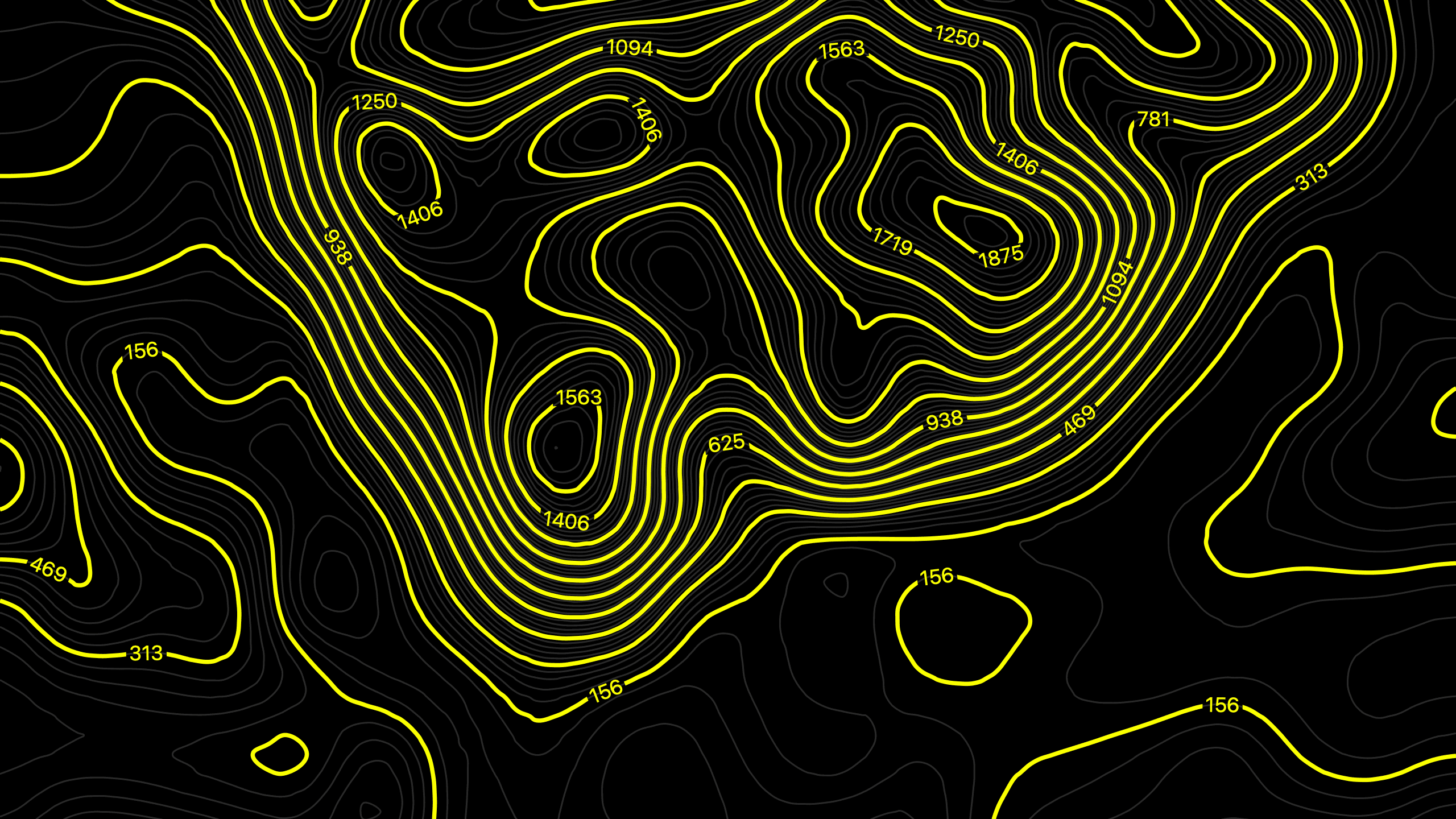
Six ways to spot a fake
1. Lines that stop in the middle of nowhere. A contour line traces one constant elevation, so it has exactly two options: close into a loop, or run off the edge of the map. It cannot simply end. Dangling line ends floating in open space are the single most common failure in generated patterns, and once you start looking you'll find them in about half the topo graphics you see.
2. Lines that touch, cross, or merge. Two different elevations can't occupy the same point. Real contours never cross — the only exception is a vertical cliff face, where they stack, and that's rare enough to be notable. Noise-derived patterns produce merges constantly, especially where the algorithm's threshold gets ambiguous.
3. No drainage network. This is the big one. Real terrain is carved by water, and water organizes itself into branching, tree-like channel systems — tributaries joining a main stem at acute angles, pointing downhill, the same structure as veins in a leaf. You can see this in the contours as chains of V-shapes. Noise fields have no water in their history, so they produce blobs and lumps with no channels connecting anything to anything. A landscape where the low points don't drain into each other is not a landscape.
4. Symmetrical ridges and valleys. In real terrain, valleys are sharper than ridges. Water erodes downward and cuts a V; ridges get weathered round. So a valley's contour V is tight and pointed, and the ridge next to it is broad and soft. Noise is symmetric by nature — flip it upside down and it looks the same, which means its ridges and valleys are interchangeable. Real terrain never survives that flip.
5. Uniform spacing everywhere. Contour spacing is slope: tight means steep, wide means flat. Real landscapes have structure to their steepness — a cliff band runs along a ridgeline, an alluvial plain spreads flat at the bottom, and the two are connected in a way that makes sense. Generated patterns have the same average spacing across the whole field, which describes a world of uniform gentle hills that exists nowhere.
6. Incoherent nesting. Every closed contour loop should sit inside a parent loop, stepping consistently up or down in elevation. Fakes routinely have loops nested in ways that would require a hill to be simultaneously higher and lower than itself.
Run any topo graphic against these six. Most fail on three or more.
Why it's worth caring about
The obvious objection: nobody's checking. It's decoration, it reads as "outdoors," job done.
Two answers.
The first is that the audience for this aesthetic is disproportionately the audience that reads maps. Hikers, climbers, cyclists, pilots, anyone who's navigated with a paper sheet. To that reader, a contour line ending mid-air is the visual equivalent of a Lorem Ipsum paragraph left in a shipped product — a small, specific signal that nobody involved knew or cared what the thing was. Trail and outdoor brands get caught by this constantly, which is a strange thing to be sloppy about when the whole positioning rests on competence in terrain.
The second is that fake topography says nothing. It's a texture. A real contour map is a specific place — a mountain someone climbed, a valley someone grew up in, a coastline someone drove. Same visual language, except one of them means something and the other is beige noise wearing a technical costume. When the real version costs the same as the fake version, choosing beige is just a choice.
The part where this gets easy
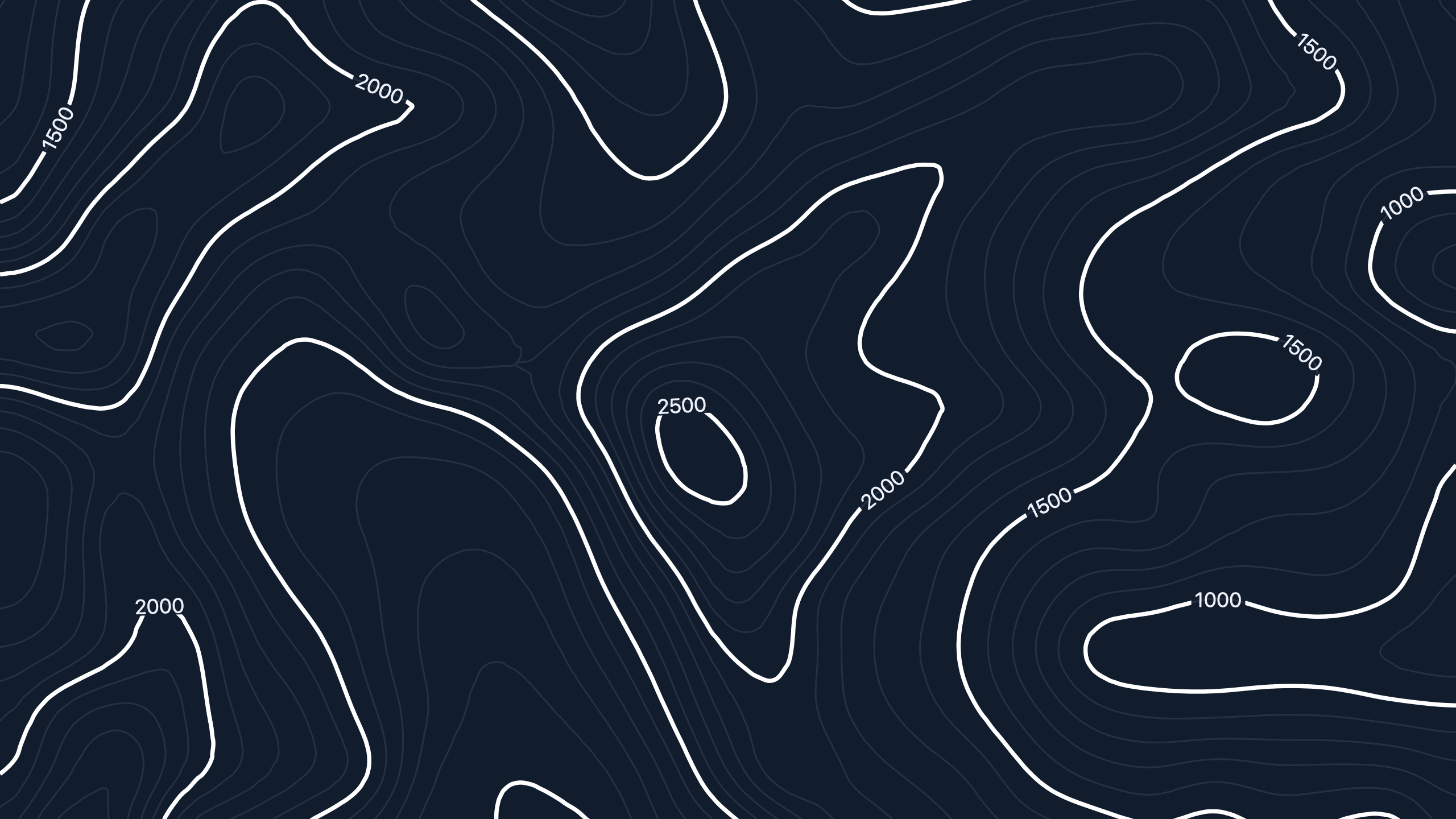
The reason fake topography spread is that it used to be the path of least resistance. Real elevation data meant QGIS, a DEM download, a projection you'd have to look up, and an export pipeline. Fake meant one filter.
That gap is closed. Footnote's topography generator pulls genuine elevation data for any coordinates on Earth and renders it in about a minute — free, no account, no watermark, and it exports at resolutions that hold up in print. Pick a real place, set radius and density, download.
Every line in the output closes or leaves the frame. The valleys drain. The Vs point upstream. The steep parts are steep because the ground is steep there.
It takes the same amount of effort as the fake one now. Pick a place that means something.
Contour lines are having a decade. They're on running shoes, coffee bags, gym walls, trail-brand hoodies, conference badges, and roughly one in four tech company backgrounds. The look is clean, technical, and outdoorsy at once — easy to see why it caught.
Almost none of it is real.
The overwhelming majority of contour patterns in circulation were generated from noise: a Perlin or Simplex field run through a threshold filter, or a stock vector someone drew by eye, or more recently an image model that has seen a lot of topographic maps and understood none of them. They're patterns shaped like terrain. They aren't terrain.
For a long time that was a defensible shortcut, because getting real elevation data meant GIS software and an afternoon. That excuse expired. But before the pitch, the interesting part: once you know the tells, you cannot look at a contour pattern the same way again.
Six ways to spot a fake
1. Lines that stop in the middle of nowhere. A contour line traces one constant elevation, so it has exactly two options: close into a loop, or run off the edge of the map. It cannot simply end. Dangling line ends floating in open space are the single most common failure in generated patterns, and once you start looking you'll find them in about half the topo graphics you see.
2. Lines that touch, cross, or merge. Two different elevations can't occupy the same point. Real contours never cross — the only exception is a vertical cliff face, where they stack, and that's rare enough to be notable. Noise-derived patterns produce merges constantly, especially where the algorithm's threshold gets ambiguous.
3. No drainage network. This is the big one. Real terrain is carved by water, and water organizes itself into branching, tree-like channel systems — tributaries joining a main stem at acute angles, pointing downhill, the same structure as veins in a leaf. You can see this in the contours as chains of V-shapes. Noise fields have no water in their history, so they produce blobs and lumps with no channels connecting anything to anything. A landscape where the low points don't drain into each other is not a landscape.
4. Symmetrical ridges and valleys. In real terrain, valleys are sharper than ridges. Water erodes downward and cuts a V; ridges get weathered round. So a valley's contour V is tight and pointed, and the ridge next to it is broad and soft. Noise is symmetric by nature — flip it upside down and it looks the same, which means its ridges and valleys are interchangeable. Real terrain never survives that flip.
5. Uniform spacing everywhere. Contour spacing is slope: tight means steep, wide means flat. Real landscapes have structure to their steepness — a cliff band runs along a ridgeline, an alluvial plain spreads flat at the bottom, and the two are connected in a way that makes sense. Generated patterns have the same average spacing across the whole field, which describes a world of uniform gentle hills that exists nowhere.
6. Incoherent nesting. Every closed contour loop should sit inside a parent loop, stepping consistently up or down in elevation. Fakes routinely have loops nested in ways that would require a hill to be simultaneously higher and lower than itself.
Run any topo graphic against these six. Most fail on three or more.
Why it's worth caring about
The obvious objection: nobody's checking. It's decoration, it reads as "outdoors," job done.
Two answers.
The first is that the audience for this aesthetic is disproportionately the audience that reads maps. Hikers, climbers, cyclists, pilots, anyone who's navigated with a paper sheet. To that reader, a contour line ending mid-air is the visual equivalent of a Lorem Ipsum paragraph left in a shipped product — a small, specific signal that nobody involved knew or cared what the thing was. Trail and outdoor brands get caught by this constantly, which is a strange thing to be sloppy about when the whole positioning rests on competence in terrain.
The second is that fake topography says nothing. It's a texture. A real contour map is a specific place — a mountain someone climbed, a valley someone grew up in, a coastline someone drove. Same visual language, except one of them means something and the other is beige noise wearing a technical costume. When the real version costs the same as the fake version, choosing beige is just a choice.
The part where this gets easy
The reason fake topography spread is that it used to be the path of least resistance. Real elevation data meant QGIS, a DEM download, a projection you'd have to look up, and an export pipeline. Fake meant one filter.
That gap is closed. Footnote's topography generator pulls genuine elevation data for any coordinates on Earth and renders it in about a minute — free, no account, no watermark, and it exports at resolutions that hold up in print. Pick a real place, set radius and density, download.
Every line in the output closes or leaves the frame. The valleys drain. The Vs point upstream. The steep parts are steep because the ground is steep there.
It takes the same amount of effort as the fake one now. Pick a place that means something.
Related Articles
Check out our full product line
Check out our full product line

🇨🇦 A Canadian Company
© 2026 Futura Gear Inc. FTNT, the illustrated FTNT logo, and Footnote Accessories Co. are trademarks of Futura Gear Inc. All rights reserved.
© 2026 Futura Gear Inc. FTNT, the illustrated FTNT logo, and Footnote Accessories Co. are trademarks of Futura Gear Inc. All rights reserved.
🇨🇦 A Canadian Company